Thursday, 18 December 2014

Technical Task B - exposure meters

Difference between ambient and flash, and how to meter for both.

Ambient light, which is also called available light. This light is the one that is presented all the time during our exposure. The best example for ambient light is simply natural light, but there are some other examples light the light at home. Photographers use ambient light in studios, called hot light, the name simple comes from the fact that they are usually on for long period of time and get very hot quickly. It's simply whatever light source there is at the time, when we're taking the photos. It is really important to find the right way to measure the light hitting your subject in an ambient lightning. We can do this by finding an appropriate exposure using the handheld ambient light meter. Because ambient light is non-directional, most people want to use the meter when they're in an environment offering diffused light. You simply place the meter in front of models/subject face, as close as you can and take the reading. You can take the reading few different times to see if it's any different, or maybe take a reading every few photos you take. 

Flash is simply an additional light source that a photographer adds to the scene. It is only a single burst of light that exist only for a short period of time. When using an additional flash in our photos, it has a really large effect on our choice of shutter speed and aperture. We also have to be careful as anything which is close to the flash is exposed to more light than anything further away. It is very easy to flash meter in studio. All you have to do is, set the right settings up on the meter, the same as you want to use on your camera, which would probably be something similar to this : ISO 200, 1/125 sec. Then you have to connect it to the main flash that you're using in a studio, and by placing it in front (usually the lightest part) of your subject/model, you are ready to take the metering by simply pressing the correct button on the metering mode. This makes all of the flashes that you are going to use go off, and the flash meter takes the metering, which means it gives you the correct aperture to use. 

It is quite challenging to balance ambient light with flash for most people. In most of the situations, while using automatic settings it works quite well, it is a little bit more difficult to balance them two on manual settings. The problem with using automatic setting is that you can loose the control very quick, because we might think that it seems easy to set the camera on automatic and let it solve the problem for you, but then we find that the results are not exactly what we wanted. In my opinion the difference is straight forward, I don't really like using flash because I think the photos look weird. I really like naturally looking photos, and I prefer to use ambient light than a flash if I am able to choose. 

Difference between incident and reflective meter readings.


Incident meter readings, is most preferable way to measure the light. Handheld incident meter reads the intensity of light falling on the subject. The reading is taken from a position of the subject. Incident meters accurately measures the amount of light falling on the subject. It is always very accurate and records the tones as well as colours and values correctly. 


Reflective meter readings, read the intensity of the light reflecting off the subject. It measures the light after it hit's the subject, however they are affected by the reflection of the subject's surface. We have to keep in mind that the reflective meter will take a take a different reading for a white object than a black object.


In order to record accurately any scene that you want to photograph, whether it's a person, an object or landscape, you have to measure the amount of light that exist in the scene. The two basic methods of measuring the light are you can either take the reflected reading by measuring the light reflecting off your subject or you can take an incident reading by measuring the light as it falls on to the subject. 

Technical Task A - health and safety

Health and safety in a photographic studio


Health and safety is very important in a photographic studio. It is very important to be careful while walking around the studio, it is very easy to trip over things like tripod, cables (which should be laid where they don't create a hazard) as well as some other props that you're using in your photo shoot. It is also very important to make sure that everyone has a space to move around the studio, we need to put things that we don't really need in one place, for example coats or bags etc.

While working in studio, it is usually dark, therefore we need to be extra careful and make sure that we don't trip over as the things are less evident in the dark. We need to pay extra attention and also taking an extra look while walking around to make sure we know where the things are. The flash light become really hot after using them for a while, we need to be careful while moving them as it can cause burns on our hands. Another very important thing is that our models may not be used to very bright lights flashing all the time, so we can't spend a lot of time in studio without any breaks. After a long time of period of staying in studio our model can have headache and their eyes may also be very tired. There is a lot of expensive equipments around the studio, we also need to careful with them while carrying them around and holding them in. Very straight forward health and safety rule, no food or drink. There is a lot of electrical equipments in the studio, by spilling any drink or food we can damage the equipments as well as cause danger for us and other people in the studio.  

Risk assessment 

This is a bird's eye view on a photographic studio that I did.

This is a risk assessment sheet.


Assessment 
Reference:
Studio photography
Activity Description:
Photo shoot
Date:
5th of Dec 2014
Student
Marcelina Skrzypczynska

Review Date:
 10th of Dec 2014
Assessment Team Members:

Overall Potential Risk Factor:
5
Course Details:
ED Photography


Level 3
Number of People Exposed:
1

Year 2
Names of People Exposed:
Anna Matvejeva
Building-Place & Exact Location
Old Building, photography studio
Is This An Acceptable Risk?

Hazard
Persons At Risk and How
Existing Control Measures

Prob
Sev
Risk Level
Additional Control Measures

Prob
Sev
Risk Level
Studio 
my model - hot lights, cables, etc
be careful
2
2
2
tell my model about health and safety in studio
2
1
2
Danger / Damage
everyone in studio - spill drink
no food or drink in the studio
2
1
2
if anyone needs a drink they should go outside
2
2
2


Task 1D - chosen films

Maleficent


Maleficent is a 2014 Disney, dark fantasy movie. Angelina Jolie plays the main role in this film. The film is a live action re-making of Walt's Disney 1959 animated film of Sleeping Beauty and it shows us the story from the perspective of Maleficent.I have decided to take photos based on this film in studio. To help me with some ideas, I have watched a film and took some notes, based on the story line as well as the look of characters, their emotions etc. I really liked the style and I have decided to dress my model as Maleficent because it would be very interesting to take photos of Maleficent showing all of her evil as well as happy and sad emotions. 


At the beginning of the movie, Maleficent who is Sleeping Beauty's villain  later on in the movie gets her revenge, is flying around happily and freely across The Moors, her beautiful Kingdom. Later on in the story we can find that one day a young boy from human realm appears, his name is Stefan, he break young Maleficent's heart and returns some years later on royal order to ensure she dies, but all he does if cut her wings of to make sure she suffers and he has an evidence of what he did to her. In return Stefan was able to take the King's crown when he dies, which happens shortly after. Stefan's daughter (Sleeping Beauty) is up to Maleficent's curse. For the next 16 years she watches Aurora, being raised by three good fairies. When times comes for Aurora to pick her finger and the curse to take effect, Maleficent realised what she did wrong, she hurries to the castle where confrontation with the King Stefan happens. It all end happily, where Maleficent becomes close to Aurora. I really like this film because it has a lot of emotions, and a happy ending. 

Miracle on 34th Street


I have picked Miracle on 34th Street because I also wanted to do a Christmas movie, as I get a chance to go to Poland over Christmas. Christmas is much better when you get to spend it with your family, therefore I have decided to pick this film. My photos for this film will be all based on snow and lovely environment with close family. 

This is a really lovely and warmhearted film. The film is about a mother who raises her daughter to aspect reality. therefore she has a problem with using her imagination, for example she doesn't believe in Santa. I would like to use this film to show that Christmas time is something we should all believe in because it's so special when you get to spend it with your family. The message that the movie is giving us is to believe in our fantasy, because without it we can struggle. 

Task 1C - research editorial pieces

An editorial piece in an opinion piece written by editorial staff of a newspaper or a magazine. Editorial piece should consider introduction, body text and conclusion, also including photographs. Examples of editorial pieces in magazines and newspapers based on films or film stars:

This is an editorial from an issue of Photoplay from 1921, recommending that readers should not see the film Heedless Moths, as it features nude scenes. As we can see this editorial piece is not very interesting, as it doesn't have any photos to help us to see what the film is about, but an editor have used interesting fonts as well as big letter to make it a little bit more interesting, eye catching as well as outstanding. Also the font makes it look a little bit more interesting. I like this because even though it's a very old editorial piece is not black and white. The editor has also put a border around the written piece, which is always useful and I'm sure I will use it in my editorial piece. The layout of the writing is also very simple. It's not one of the best editorials but because it's from 1921 I think it's good.  

These are the two articles that I have found online from a magazine called Empire. I really like this magazine because it gives us a lot of film reviews, as well as movie news and celebrity interviews. Most of the editorial pieces in this magazine are very similar. All of them consider interesting layouts, photos and simple text, which all together look really good. 

The first editorial piece from Empire magazine is a review about film Harry Potter And The Deathly Hallows - Part One from 2010. The first thing that really caught my eye is a part of the top photo which has been cut out to put a text on it. I think it look really interesting. Plus, there's another small photo at the bottom of the director. I think this is very interesting as we never see people behind the camera. The main photo at the top shows us the main character of the film, which is Harry Potter. It's a photo cut out of one of the movie scenes which makes us interested even more to what the film is going to be about and it makes us want to read the article.The layout of the text is simple but works really good. It is divided into three columns, used the same size and font for the body text and small introduction, only the colours are different to separate them two. The title of the film is in a lot more bigger size than the rest of the text which is really eye-catching. Overall I like this article but I think there might be some things that can be improved. For example, there could be more smaller photos from the film. Another thing that in my opinion could be improved is the title of the film, which even though is nice and big sized it could be bold to make it stand out even more. The alignment of the text could be also set to the middle not to the left to make it look neat. Overall I like this article. 

In this article we can see a review of Twilight - New Moon. This article is a lot more interesting for me than the Harry Potter editorial piece. First of all I really like the only photo at the top, which is also a photo from one of the movie scenes. There are also a lot of borders in this editorial piece as well as thick lines which separate paragraphs from each other. I think this looks really effective as it helps us to read and it also makes it a little bit more interesting. There is a lot of text in this article. The first writing piece that caught my eye, is the three small paragraphs in the box which have been placed on the photo, I really don't like this as I don't think it looks nice because it looks messy, but this is just my opinion. The title of the film is in big, bold letter and even that it still doesn't stand out as much as the writing at the top of the page 'in cinemas', but it might be because it's on a bright, red background. Subheading is a little bit smaller than the heading and I also think it looks nice. The body text is all in the same size, but some important sentences at the beginning have been made bold. Another thing that caught my eye, is the big, red, bold text at the bottom left of the article, which really stands out as well. Overall the colours match well together. I think that editor of this editorial piece have used red on purpose for this film, as red colour represents love but also blood, and as we know Twilight is all about vampires and blood, so the colour that the editor have used matches very well. 

Thursday, 11 December 2014

Task 1B - research portraiture


Portraits are photographs of a person a group that usually show emotions. In my opinion it is a lot easier to show emotions in location rather than in studio, but you can also be very creative in studio if you have the chance to. The most important thing in portraiture is to capture the eyes and face in sharp focus. Posing is another very important thing in portraiture photography, because it can a have dramatic affect on our photos. A small change where the model is smiling or not or the direction they're looking at can completely change the feeling of the photo. 

When we photograph portraits in studio, which are usually just the faces but sometimes a little bit of a body can be included, we have the control over the light therefore we can get some really interesting shadows on faces. We can adjust directions as well as intensity of the light. There are no specific rules for setting up the camera, but few important setting will give us a better quality. The lowest ISO to begin with, most people advice to shoot in RAW. Because people tend to blink and move around a lot we should use a fast shutter speed, which will also help us to ensure that the shots are sharp and it would also avoid camera shake if we're taking the photos without using tripod. Lenses also have a big impact on the portraits in studio. It's good to experiment with wide apertures to capture a very shallow depth of field, but to do this we need to remember to focus on the eyes. 


Location portraiture can be very creative. We can be very creative with the composition in location portraiture, as we can zoom in really close or just take the photo of half of the face leaving another half of the photo with a interesting background. We can also take them in all kinds of weather, even sunny but we just need to know what kinds of angles to use. We need to pay attention of which way and where the light is shinning, because if the sun light is strong we need to place the model so that they cover up the sun.

Thursday, 27 November 2014

Studio and Location photography - first practice

Outdoor Location photography

I have been using my 50 mm lens for outdoor location, and only natural light.


This is my first outdoor location. I have decided to ask my friend to stand next to the college sign, where I was able to see her reflection. She was looking directly in to the camera while I have captured her as well as her reflection in a landscape format.  I like the idea of reflection but because it was a quick photo I didn’t think about the background carefully. We can unfortunately see a person walking in the reflection, which makes her shadow unclear. Also we can see some buildings in the background of the photo, but it doesn’t really affect the photo very much as I have used a large depth of field.


In my second outdoor location I have thought more about the background of the photo. We can see some nice leading lines behind Kitty, whereas she’s sanding in the middle of the road where they all start. I have also framed her a little in the right side of the photo rather than in the middle. I also like the old building in a colour of red, and the lines on the road stand out nicely as they’re bright yellow.  


This is my third outdoor location photos. In this photo I was being careful about the foreground. I made sure that the circle in right in the middle, but unfortunately I didn’t pay much attention to the background where we can clearly see that the photo is not straight because of the building line going down a little bit. Overall I like the composition of this photo as well as the pose of my model who is looking to the side, also not standing up, which makes him hide behind the nice steam, which has been blown to the side by the wind, uncovering my models face. 


This is my next photo from outdoor location photo shoot. I have decided to take a portrait of Kitty, while our teacher is also taking a photo of her. I like this because she’s looking in my camera but we can also see him taking photo of her. One thing that I didn’t think about was the background of this photo, because there’s a lot happening in the background and it doesn’t really look nice.  


This is my next photo from outdoor location shoot. I like this photo, but again I have concentrated more on the person rather than background and the model. I like her face expression, as well as idea of holding this fence which looks like she wants to get out of somewhere. The composition is also good, but it would have been a lot better if I would do think on the nice background of some building.

This is my last photo from outdoor location. In this photo, even though the locker is in front of my model I have made sure that she’s the one that is in focus because she’s the main subject in this photo. 

Contact sheet - Outdoor Location photography


It was very helpful to firstly take photos in an outdoor location, because I was able to concentrate on the foreground as well as the background. It was also very interesting as I was able to try out my 50mm lens which I haven't used properly before. I am happy with the photos that I took, even though the weather was very bad.

Indoor Location photography


This is my first photo from indoor location, where I have used my additional flash. I really like this photo, that I have took from low angle. The first thing that I like is that by using additional flash I didn’t create any unwanted shadows. She’s not looking directly into the camera, and her pose is also nice, as she’s holding on to the stairs handles, from which I have created almost a little frame to the photo.


This is my second photo from indoor location. I have also been using my additional flash, but because I have decided to take a portrait format photo it has created some shadows at the bottom part of the photo. Overall I like the place and composition of this photo, as it looks really like. We can find some leading lines through the photo from stairs handle. Whereas my model is standing right in the middle, it makes us follow our eyes to look at her. 


This is another photo from indoor location which I think is one of my best photos from this day. I have also created a frame from stairs and framed her directly in the middle of the photo. I like how she’s looking up because the flash is directly on her face and it didn’t create any unwanted shadows. She’s the only one which is in focus in this photo, which lets us concentrate on her rather than on the stairs handles in front of her in the photo.


This is my next photo, which is very similar to my previous photo, but this time is a close up. I have still decided to do it through the barriers of the stairs to create a frame in my photo, but the focus is still on my main subject of the photo. I have also been using an additional flash to create her skin look nice and soft and also natural. I have framed her a little bit to the left side of the photo, with the format of landscape picture.


This is my next indoor location photo. I have been using a natural light for this. Danny is more or less framed in the middle, but I have also wanted to get the blue door in the background in the photo. I like this photo, because it looks natural.


This last photo from indoor location is very similar to my previous one, but I have decided to take it as Kitty’s shirt match very nicely with the background, as the colours are very similar. I have framed her in the middle of the photo, using natural light coming from big window, also using big depth of field as the background wasn’t very interesting.

Contact sheet - Indoor Location photography


I am really happy that I got a chance to take some indoor location photos in college, because the light is very bad and the conditions were quite hard to take pictures in, but because of this I have learnt how to use my additional flash, and I think that some of the photos came out great. I didn't like the idea of using the flash before, but after this technical task, I have realized that you can take some really nice photos with flash while working in an indoor location, with really bad lightning. I was also using natural light, coming through the big windows on some corridors.

Studio photography


This is my first studio group photo, taken from eye level angle in a landscape format. This photo was taken with a light box, therefore we can see that my models faces are nice and soft, looking natural. I have also asked my models to make a funny face so that the photo is a little bit different from other ones. I have also put the models from smallest to tallest to make it look nice and neat. 


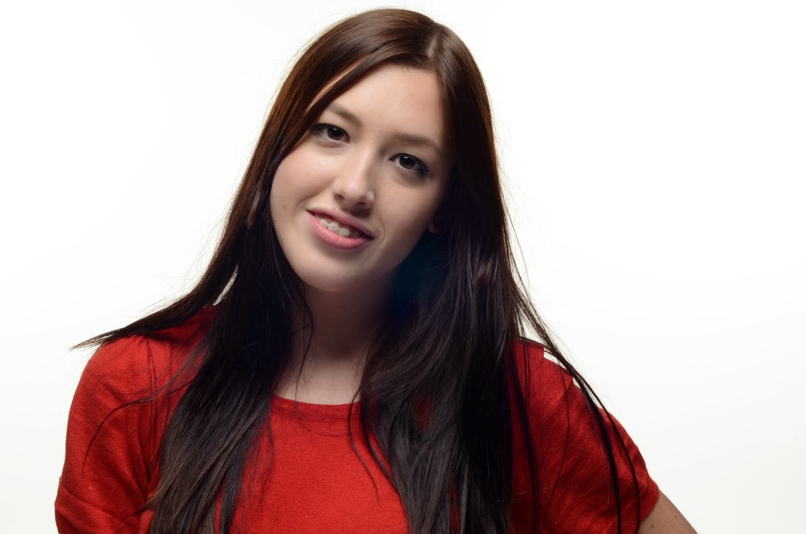
This is my second photo from studio. I have decided to take a portrait of my model, and framed her in the middle of the photo. My model is smiling, looking directly into the camera. Unfortunately my lens was a little bit dirty, and I didn’t realise it until I have put my photos on to the computer and realised there is a blue circle on some of the photos, right in the middle.  Overall I like this portrait, as its sharp and focused correctly.


This is my next photo from studio. I was also using a soft box for this photo which is in a portrait format. I have framed my model in the middle of the photo and decided to use a little bit of movement. Overall I like this photo because it’s also a little bit different from the rest of my studio photos.


This is my next photo of two of my models. I have decided to ask Danny to stand the other way round, and Dimitra to stand in front of him, looking at me through his shoulder. I like the contrast between her red t-shirt and his yellow writing on the t-shirt. I like the photo in general.


This is my next photo from studio, that I have decided to make in black and white, because I thought it would look better, and I my opinion it does. They both look happy and the photo looks really nice in general because of the composition, nice framing and poses of my models.

This is my last group photo from the studio photo shoot. I have decided to ask all three of them to sit on the floor and smile directly into the camera. We have been using light box therefore the photo looks natural and soft. They are all sat in a different position which makes the photo look a little bit messy but I think it’s effective. 

Contact sheet - Studio photography


Overall, I am happy with my photos from studio. It was the third time in my life when I was working in a photography studio, and I have learnt new things. I think that the photos would e even more interesting if we had a time for planning, because I wasn't sure how to pose my models and I have wasted a lot of time because of this, but as it was only a practice I am happy with the final results.

Task 1A - historical and contemporary research

Historical photographers

~Marylin Monroe~ 1957
Photographer: Richard Avendon


I have decided to look at the photographer who took photos of the most beautiful women. It was Richard who had the great opportunity to work with such an amazing icon. He was an American fashion, but mainly portrait photographer. His portrait photography define America's image of style. I really like his photos, even though most of the are black and white. The contrast of the photos are really good, and they look amazing in black and white. He has photographed for magazines like Vogue, as well as worked with advertising campaigns for Versace or Calvin Klein. 


~Celebrities~ 1959
Photographer: David Bailey

David is an English fashion as well as portrait photographer. He has starting working in photography industry in 1959 and still continues working now. I really like David's Bailey's photography as it is simple but show a lot of emotions in his black and white portraiture photography. He has been working with a lot of famous people like Mick Jagger, Rolling Stones and The Beatles. He always goes for simplicity in his photos, which looks really natural and nice. Bailey has also recently gained a lot of rewards for his amazing portraiture photography. 


Contemporary photographers

~Maleficent~ 2014
Photographers: Mert Alas and Marcus Piggott.

I have picked to do a research about photographers from Maleficent, Disney film from 2014, because this is my first idea of a film that I want to work on. Therefore I have decided to look at the photographers work from this  film. I have found that Mert Alas as well as Marcus Piggot were both taking the photos of Maleficent (Angelina Jolie) for posters. They were working is studios, just as we have the opportunity to work in studio in this project. Their work has really caught my eye, as the face expressions as well as the lightning are clearly thought through and we can really see it in their photos, especially photos for a poster to Maleficent film. They have also work with other celebrities like Madonna, Lady Gaga, Victoria Beckham or Jennifer Lopez. They are mainly know for fashion photography. They met for the first time in England in 1994.


~Harry Potter~ 2011
Photographer: Jaap Buitendijk

This photographer grew up in Holland. I really like his photos from the last Harry Potter film. They're are very high quality photos and show a lot of emotions, they are mainly photos in action. I really like the way he captures the poses, emotions as well as the equipments and the background of the photo. It looks really good. Jaap has studied documentary photography and since then he started exploring documentary skills. He captured beautiful photos on film plan as well as behind the scene. He worked within a lot of films including Harry Potter as well as some other as World War Z or Gladiator.


~Resistance~ 2011
Photographer: Jules Heath

Jules Heath has a very strong passion for photo journalistic and fine art. His shots are taken spontaneously but carefully composed, and cropped for maximum impact. His goals is to make the picture that challenge the viewer, asking more questions that they answer. Which simply means he wants the viewer to look deep into his photography. I think it really works, because all of his photos have different meanings and they are very powerful in terms of emotions. He has a lot of film credits on her list such as Resistance, and many more. He has also shot for many TV series like BBC, Sky, CH4. He has worked with clients like BBC Worldwide, 20th Century Fox, SKY, and many more. For his excellent work, not only in my opinion he gained some awards like : 2009 - World Wildlife Photographer of the year, 2012 - PND World In Focus and Creative Review Photography Annual. 


~Series of Disney themed celebrity portraits~ 2014
Photographer: Annie Leibovitz

Annie is considered as one of the best portrait photographers in America. Annie started her career with the Rolling Stones magazines in the 70's, and from then on she has worked with a lot of celebrities. I really like her photographs that she took with different celebrities with the theme of Disney movies. She has a lot of photographs from all Disney movies, but I have decided to pick these four which stood out the most to me. She uses a lot of Photoshop in her photos, especially in this photo shoot, but who doesn't? I really like the different kinds of effect on the photo which match so well with the photography of the celebrities. In my opinion there's something magic in every single photo that she took, and I think this is what she wanted it to be like as it is all based on Disney.


Scarlett Johansson as Cinderella.
Jennifer Lopez and Marc Antony from Aladdin.
Beyonce, Oliver Platt, and Lyle Lovett as Alice in Wonderland. 
Taylor Swift as Rapunzel.


Historical film stars


Julie Andrews~
Julie born in 1935, is one of the greatest film stars. She sang like an angel in Mary Poppins. Julie is an English film stage actress, singer, author, theatre director and dancer.


Charlie Chaplin~
Charlie was born in 1889  and died in 1977. He was one of the greatest English actors, comedian as well as film makers. Chaplin became a worldwide icon through his screen persona 'the Tramp' and is considered one of the most important figures in the history of the film industry. His active years through his life were 1899 till 1976.Chaplin has also wrote, directed, produced, edited, statrred in as well as composed music for most of his film. 


Contemporary film stars

Angelina Jolie~
Angelina born in 1975, is an american actress as well as filmmaker. She has received a lot of important awards, and was named Hollywood's highest-paid actress in 2009, 2011 and 2013. She is a beautiful women, who played a lot of amazing roles in contemporary films.


Leonardo DiCaprio~
Leonardo born in 1974, played a lot of great roles in amazing as well as very well known films. Two of my favourite films with Leonardo DiCaprio are definitely Titanic as well as Romeo and Juliet. He is an american actor as well as film producer. He has been nominated for a lot of important award, winning most of them including Golden Globe for the best actor. 


Historical Portraiture

The Blackboard Poland, 1948
David 'Chim' Seymour (American, born Poland, 1911 - 1956) ~ 

One of the founders of Magnum Photos in 1947. Chim firstly gained recognition for his portrait photography from Spanish Civil War and the Popular Front in Paris during World War 2. His ability to identify and record very important key moments in the events and of the surroundings, allowed him to access the emotional look of a subject. He has used his photography talent mainly for photographic children.


Still from an Untitled Film, 1978
Cindy Sherman (American, born 1954) ~

Between 1977 and 1980, Cindy photographed herself in a series of sixty-seven staged scenarios meant to suggest Hollywood films of the 1950's. 


Contemporary Portraiture

Jamie Warren ~
I have found really interesting photographer, who did a very inspirational as well as funny photo shoot. Jamie Warren decided to do portraits of celebrities as food. Jamie is a photographer who lives in NY. She has received an amazing reward in 2014, it was Baum Reward for an Emerging American Photographer. She has also exhibited a lot of solo projects in different kinds of museums etc. all around America.

 Tuna Turner
Lasagna Del Rey
Madonut

 Andreas Laszlo Konrath~
I have this American photographer who do a lot of portrait, mainly of friend but has few series of celebrities portraiture as well. I have picked him because I really like the compositions that this photographer uses as well as how he frames the photos. Not all of them are straight and some of them have bits cut off them, but they look really effective. 


 Historical Films

  • Dirty Dancing ~ 1987
  • Scarface ~ 1983
  • Casablanca ~ 1943
  • Singing' in the rain ~ 1952
  • King Kong ~ 1933
  • Snow White and seven dwarfs ~ 1937
  • Mary Poppins ~ 1964
  • Miracle on 34th Street ~ 1947
  • The Godfather ~ 1972
  • Charlie Chaplin ~ 1925

Contemporary Films

  • Maleficent ~ 2014
  • Asterix and Obelix Mission Cleopatra ~ 2002
  • Zorro ~ 1998
  • Titanic ~ 1997
  • Pulp Fiction ~ 1994
  • Taken ~ 2008
  • Jingle all the way ~ 2014
  • Home alone ~ 1990
  • The Hunger Games ~ 2013
  • Harry Potter and Deathly Hallows ~ 2007