Thursday, 18 December 2014

Technical Task 3B - studio light

Soft box


This tent-like structure fits over the flash head. The materials used for the sides is generally silvered on the inside, so that all the light is reflected forwards. At the front is a large, rectangular piece of white diffusing material, which softens the light. The larger the soft box the wider the spread of the light. Many professional photographers use light boxes simply because there is nothing like a soft box when it comes to providing soft light for any kind of styles of photography such as food, fashion, product or even portraiture. Soft boxes play an important role for fill, separation and edge lighting. All of the photographers can't imagine photography without soft boxes. 


I have chosen these two photos as an example because I think they represent soft box very well. Soft box makes me think of nice and warm pictures, creating a soft texture, therefore I think mum and a baby are two perfect examples of soft box.


Beauty dish


Beauty dish is a lighting device that use reflector to distribute light toward a focal point. The light created in between of the flash and soft box,giving the image contrasted look, which adds more dramatic effect to our photos. Most of them have white painted inside of them to soften the light. Nearly all professional photographers  use beauty dish only for portraits. 

I have chosen these photos as an example of beauty dish because I really think it worked really well on these portraits. The model's poses are simple, but very effective because of their face expressions. Their faces look really natural and pretty because of the beauty dish. 


Standard reflector dish


This standard lighting accessory is usually provided with the flash head. The bowl shaped metal reflector, stops light from spreading over too large an area, while bouncing back, points the light to the direction of the subject. The results will still be quite strong, providing a harsh shadow. In this case the size plays a big role, because the bigger the reflector the softer light we get.


These two photos are my favourite reflector photos that I could fins as an example. On the first photo we can see really nice shadows created by reflector. Whereas on the second picture we can see a really good example of the light, lighting directly on to the model with hash light. 


My photography for standard reflector dish


This is my first group photo from studio, using standard reflector dish. This is not one of my favourite the of light to use in the studio as it creates some shadows which are not really interesting in group photos, but I think it might look a lot better on portrait photography. I think the shadows on portraits would be a lot more interesting that this one, on this photo. I have put my models from the lowest to the tallest, the lowest one being the closest to the reflector which was on the left side. I did this to make sure that no one has a shadow on their face. Because if the tallest person would be at the front then the rest of them would have a shadow on their faces. By posing them like this it also makes the photo look neat and nice. I have also left a bit of space at the top as well as the bottom while framing it, but I had to leave only a little bit at the sides as if I would leave more then we would be able to see the outside of the white background.


Snoot

Snoot is mainly used for creating a dramatic bright light. Snoot is a tube which allows to throw the light without any spread. When using snoot, a spot of bright light is created, which is round or oval shape, depending on the angle of the light. It can create really beautiful shadows on our models face. There are also different coloured filers that you can put them onto the snoot light and create some nice portraits.


I really like these two examples of snoot. The first photo show us how we can use a snoot with filter to create nice colours for example on hair or face of our model which nicely spreads out. The second photo clearly represents the mystery feeling of the photo and how the snoot is used to light into one direction. 


My photography with snoot


This is my first group photo from studio, using snoot lighting. First of all, even though the background of the photo is really dark, we can see that there is a darker part of it on the right hand side as I wasn't able to fit all of the models in the studio background and that's why it created the big jump from light to bright. It was very hard to see through the camera because it was really dark in the studio, but I have managed to frame the photo quite well, I left enough space at the top and a little bit at the sides not to cut anyone out of the photo. I have placed the models to make sure that no one is in front of anyone and we don't have unwanted shadows on anyone's face. We can see that the light was coming from the left hand side, as Molly's face (girl on the left) is really bright, where as we move along to left hand side the light is fading on each person's face, except Lewis (on the left) who was standing behind Molly, that's why he's face is not as bright as Molly's but he still got some light reflecting on him as well. 


This is my second group photo from studio, also using snoot lighting. In this photo the same thing happened with the background as in the first photo, but If I would move Umar a little bit closer to Dymitra (two models on the left) I might have been able to fit them all in the studio background drop. In this photo Dymitra and Saif got the best light reflection on them as they were bothy standing in the right place (in the middle). We can see that Molly is standing too near to the light that's why her face is really bright, where as Lewis and Umar are too far away and they have only a little bit of the light on their faces. 

Reflector


When using a reflector in portraits, the reflector will bounce the light onto the model and this will give you and instant beautiful result every time. Reflector are used to remove the shadows from models face (main feature that we focus on when we take the photo). The reflector open up the shadows an allow the light to shine on to the models face. The white reflector give us an effect of natural look of the face, where as the silver reflector makes the model stand out to the viewer because of the bold glow of the reflector. We can find them in different sizes, which is very useful, because sometimes we might need a small one for still life photography and sometimes we might be needing a bigger one.


I really like this photo as an example of using the reflector in our photo. By using a reflector in this photo the girls face look really really soft as well as natural. The reflector also made her eyes stand out very well, and gave a beautiful shine in her blue eyes.


Soft light

Soft light is completely different from hard light. Soft light makes the image a lot warmer than the hard light as well as softer in colours. The best thing about soft light  is that it tend to curl around the subject we are photographing. It also seems to cast shadows with soft, not hard edges around the subject we're photographing. Another thing about the soft light in studio is that the closer the subject is to the light the softer the light will be curling around the subject. The soft light also makes people look beautiful as well as younger. This makes the image to look more pleasant to look at, due to the great skin texture which looks really soft. This light is really good to use for modelling photos in a fashion magazine.   
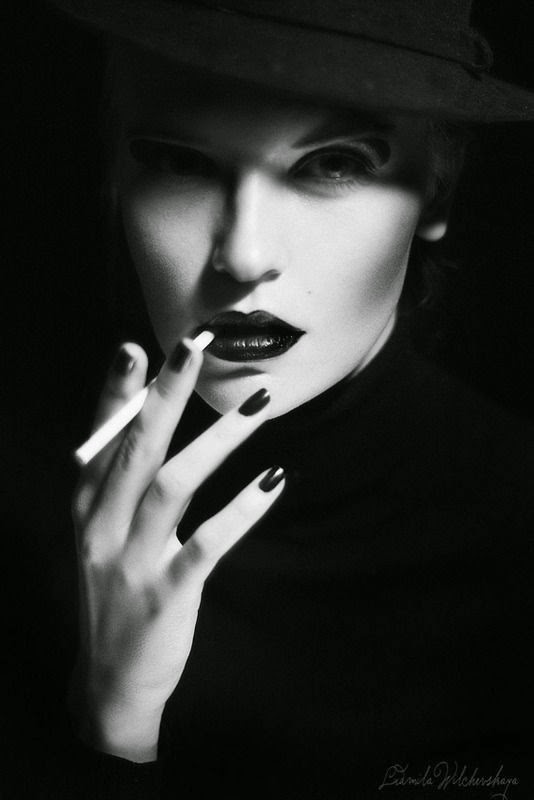
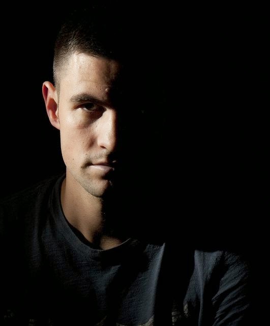


Hard light

Hard light is a technique that makes our model who is being photographed more vibrant and more eye opening while viewing the image. Hard light photos always have a lot of depth of field in the image, so that the only thing that catches your attention is the model who we're focusing on.Hard light mainly produce fine lined shadows from a single light source, which is mainly the sun in outdoor location, because of the natural brightness, but it can also be used in a studio, with flash lights. 


Technical Task 3A - high and low key lighting

High-key

High is is free from dark shadows. High key image feels airy and light, it's usually a happy picture. It's when in the image the bright and white tones dominate.


High Key lighting is a style of lighting that makes the whole image look very over-exposed, this means by making the image brighter than normal so that hardly any shadow was presence during taking the photo. High key basically means that the image's key tone is high, just as we can see in all of the examples that I have shown.  It produces image with no shadows, with bright white background. When looking at high key image, they give us a feeling of mainly happiness and a calm soft feeling. 


High key is usually done on a white background, but can also be done just on plain white wall. To do this photo you will need two light to illuminate our background. Then we need another light which is shinning directly on to our model. After research on high key I have realized that all studio photographers use the same settings, to get a blown, white background. They set up background light at least one f-stop over the subject light, which is usually f/11 and f/16. High key lighting can be great inside, in a studio as well as outside of a studio. If you wanted to create a high key image outside you would have to over-expose it.


High-key photographers


Kate Hopewell-Smith~
I really like Kate's high-key photography. I have really enjoyed looking through her gallery, as she capture's individual's characters in a beautiful as well as honest way. By doing this she creates some really lovely and beautiful as well as unique images which show a lot of emotions. She is very comfortable with what she's doing, and we can really see this in her photos as she likes to experiment quite a lot, but it always works out very well. I think my favourite photos from Kate's gallery are photos of children.

Angus Thomas~
Angus is a contemporary photographer, who does a lot of portrait photography, mainly high-key. He is an award-winning portrait photographer with a wide range experience. His ability to capture the moments in a very creative way, has earned him a respect and trust of all of his clients as well as booking agents. As a portrait photographer Angus's style is contemporary, but we can also see a little bit of tradition in all of his photography. Angus is a great inspiration for everyone. We can really learn a lot from him by just looking at his photos as well as get a lot of creative inspiration by looking at the composition of the photos, how to frame them and the most important thing, is the ideas of the photos, which are very creative.

Low-key

Low key lightning is a simple technique that can bring instant drama to our photos. It is a style of lighting that makes the whole image look very under-exposed. It's a type of picture that is dominated by dark tones. Low key is usually dramatic and full of mystery. It is necessary in creating a chiaroscuro effect. This lighting technique is the complete opposite to high key lighting, but all you have to do is under-expose the image by decreasing the aperture by two F stops. By under-exposing the image, it means that there hasn't been enough light going in to the lens to capture enough light onto the image which is being taken.


It's not very hard to create a low key image, because all you need is your camera and one light source. When choosing the light, we need to make the sure that it wouldn't reach the background. Depending on the results we are wanting, we can also use a reflector. Camera setting are simple, ISO needs to be set at the lowest, which is usually 100, and should not be changed through the photo shoot, as a low ISO will give us a good quality of a photo, as well as keeping it both dark and noise-free. They all you need to do is just to make sure you choose the right settings for shutter speed and aperture to achieve the best effect for the light that we have chosen. From then on, you just have to experiment with the angles, composition etc.


When using low key lighting, black and white photos are a popular choice while editing, as they really bring the light to the shadows. It also gives us the dramatic and mystery effect. When you look at low key images, it makes the viewer feel as if there is some mystery behind the image and this is because most of the images are dark. I think low key would also be good to take photos at night.


Low-key photographer

Sean McGrath~
Sean is a contemporary wedding photographer. I have found his by accident as he does except from lovely wedding photos a lot of amazing low key portraits. I really like his photos, as we can see that the contrast as well as the compositions of his photos are very thought through. Another important thing about Sean that I have spotted is that all of his photos are different. He's very creative and tries his new ideas all the time, which gave me a lot of inspiration and I should really think about this in my own photography. He also concentrates all every single small detail in his photos, I really like this photographer. 

Which style?

Personally, I really like both of the effect. I really like high key lightning on happy photos, they look really great, but for me is too much. Also my photo shoot in studio which will be based on the film Maleficent which is more kind of mystery film than happy film, because there is more evil than good. In this case the best style would be low key light, but I don't want them to be black and white as the film is new. So I will try to do it in colour, but the colours will be dark. As low key gives us a mystery feeling, I prefer to use it. 

Technical Task B - exposure meters

Difference between ambient and flash, and how to meter for both.

Ambient light, which is also called available light. This light is the one that is presented all the time during our exposure. The best example for ambient light is simply natural light, but there are some other examples light the light at home. Photographers use ambient light in studios, called hot light, the name simple comes from the fact that they are usually on for long period of time and get very hot quickly. It's simply whatever light source there is at the time, when we're taking the photos. It is really important to find the right way to measure the light hitting your subject in an ambient lightning. We can do this by finding an appropriate exposure using the handheld ambient light meter. Because ambient light is non-directional, most people want to use the meter when they're in an environment offering diffused light. You simply place the meter in front of models/subject face, as close as you can and take the reading. You can take the reading few different times to see if it's any different, or maybe take a reading every few photos you take. 

Flash is simply an additional light source that a photographer adds to the scene. It is only a single burst of light that exist only for a short period of time. When using an additional flash in our photos, it has a really large effect on our choice of shutter speed and aperture. We also have to be careful as anything which is close to the flash is exposed to more light than anything further away. It is very easy to flash meter in studio. All you have to do is, set the right settings up on the meter, the same as you want to use on your camera, which would probably be something similar to this : ISO 200, 1/125 sec. Then you have to connect it to the main flash that you're using in a studio, and by placing it in front (usually the lightest part) of your subject/model, you are ready to take the metering by simply pressing the correct button on the metering mode. This makes all of the flashes that you are going to use go off, and the flash meter takes the metering, which means it gives you the correct aperture to use. 

It is quite challenging to balance ambient light with flash for most people. In most of the situations, while using automatic settings it works quite well, it is a little bit more difficult to balance them two on manual settings. The problem with using automatic setting is that you can loose the control very quick, because we might think that it seems easy to set the camera on automatic and let it solve the problem for you, but then we find that the results are not exactly what we wanted. In my opinion the difference is straight forward, I don't really like using flash because I think the photos look weird. I really like naturally looking photos, and I prefer to use ambient light than a flash if I am able to choose. 

Difference between incident and reflective meter readings.


Incident meter readings, is most preferable way to measure the light. Handheld incident meter reads the intensity of light falling on the subject. The reading is taken from a position of the subject. Incident meters accurately measures the amount of light falling on the subject. It is always very accurate and records the tones as well as colours and values correctly. 


Reflective meter readings, read the intensity of the light reflecting off the subject. It measures the light after it hit's the subject, however they are affected by the reflection of the subject's surface. We have to keep in mind that the reflective meter will take a take a different reading for a white object than a black object.


In order to record accurately any scene that you want to photograph, whether it's a person, an object or landscape, you have to measure the amount of light that exist in the scene. The two basic methods of measuring the light are you can either take the reflected reading by measuring the light reflecting off your subject or you can take an incident reading by measuring the light as it falls on to the subject. 

Technical Task A - health and safety

Health and safety in a photographic studio


Health and safety is very important in a photographic studio. It is very important to be careful while walking around the studio, it is very easy to trip over things like tripod, cables (which should be laid where they don't create a hazard) as well as some other props that you're using in your photo shoot. It is also very important to make sure that everyone has a space to move around the studio, we need to put things that we don't really need in one place, for example coats or bags etc.

While working in studio, it is usually dark, therefore we need to be extra careful and make sure that we don't trip over as the things are less evident in the dark. We need to pay extra attention and also taking an extra look while walking around to make sure we know where the things are. The flash light become really hot after using them for a while, we need to be careful while moving them as it can cause burns on our hands. Another very important thing is that our models may not be used to very bright lights flashing all the time, so we can't spend a lot of time in studio without any breaks. After a long time of period of staying in studio our model can have headache and their eyes may also be very tired. There is a lot of expensive equipments around the studio, we also need to careful with them while carrying them around and holding them in. Very straight forward health and safety rule, no food or drink. There is a lot of electrical equipments in the studio, by spilling any drink or food we can damage the equipments as well as cause danger for us and other people in the studio.  

Risk assessment 

This is a bird's eye view on a photographic studio that I did.

This is a risk assessment sheet.


Assessment 
Reference:
Studio photography
Activity Description:
Photo shoot
Date:
5th of Dec 2014
Student
Marcelina Skrzypczynska

Review Date:
 10th of Dec 2014
Assessment Team Members:

Overall Potential Risk Factor:
5
Course Details:
ED Photography


Level 3
Number of People Exposed:
1

Year 2
Names of People Exposed:
Anna Matvejeva
Building-Place & Exact Location
Old Building, photography studio
Is This An Acceptable Risk?

Hazard
Persons At Risk and How
Existing Control Measures

Prob
Sev
Risk Level
Additional Control Measures

Prob
Sev
Risk Level
Studio 
my model - hot lights, cables, etc
be careful
2
2
2
tell my model about health and safety in studio
2
1
2
Danger / Damage
everyone in studio - spill drink
no food or drink in the studio
2
1
2
if anyone needs a drink they should go outside
2
2
2


Task 1D - chosen films

Maleficent


Maleficent is a 2014 Disney, dark fantasy movie. Angelina Jolie plays the main role in this film. The film is a live action re-making of Walt's Disney 1959 animated film of Sleeping Beauty and it shows us the story from the perspective of Maleficent.I have decided to take photos based on this film in studio. To help me with some ideas, I have watched a film and took some notes, based on the story line as well as the look of characters, their emotions etc. I really liked the style and I have decided to dress my model as Maleficent because it would be very interesting to take photos of Maleficent showing all of her evil as well as happy and sad emotions. 


At the beginning of the movie, Maleficent who is Sleeping Beauty's villain  later on in the movie gets her revenge, is flying around happily and freely across The Moors, her beautiful Kingdom. Later on in the story we can find that one day a young boy from human realm appears, his name is Stefan, he break young Maleficent's heart and returns some years later on royal order to ensure she dies, but all he does if cut her wings of to make sure she suffers and he has an evidence of what he did to her. In return Stefan was able to take the King's crown when he dies, which happens shortly after. Stefan's daughter (Sleeping Beauty) is up to Maleficent's curse. For the next 16 years she watches Aurora, being raised by three good fairies. When times comes for Aurora to pick her finger and the curse to take effect, Maleficent realised what she did wrong, she hurries to the castle where confrontation with the King Stefan happens. It all end happily, where Maleficent becomes close to Aurora. I really like this film because it has a lot of emotions, and a happy ending. 

Miracle on 34th Street


I have picked Miracle on 34th Street because I also wanted to do a Christmas movie, as I get a chance to go to Poland over Christmas. Christmas is much better when you get to spend it with your family, therefore I have decided to pick this film. My photos for this film will be all based on snow and lovely environment with close family. 

This is a really lovely and warmhearted film. The film is about a mother who raises her daughter to aspect reality. therefore she has a problem with using her imagination, for example she doesn't believe in Santa. I would like to use this film to show that Christmas time is something we should all believe in because it's so special when you get to spend it with your family. The message that the movie is giving us is to believe in our fantasy, because without it we can struggle. 

Task 1C - research editorial pieces

An editorial piece in an opinion piece written by editorial staff of a newspaper or a magazine. Editorial piece should consider introduction, body text and conclusion, also including photographs. Examples of editorial pieces in magazines and newspapers based on films or film stars:

This is an editorial from an issue of Photoplay from 1921, recommending that readers should not see the film Heedless Moths, as it features nude scenes. As we can see this editorial piece is not very interesting, as it doesn't have any photos to help us to see what the film is about, but an editor have used interesting fonts as well as big letter to make it a little bit more interesting, eye catching as well as outstanding. Also the font makes it look a little bit more interesting. I like this because even though it's a very old editorial piece is not black and white. The editor has also put a border around the written piece, which is always useful and I'm sure I will use it in my editorial piece. The layout of the writing is also very simple. It's not one of the best editorials but because it's from 1921 I think it's good.  

These are the two articles that I have found online from a magazine called Empire. I really like this magazine because it gives us a lot of film reviews, as well as movie news and celebrity interviews. Most of the editorial pieces in this magazine are very similar. All of them consider interesting layouts, photos and simple text, which all together look really good. 

The first editorial piece from Empire magazine is a review about film Harry Potter And The Deathly Hallows - Part One from 2010. The first thing that really caught my eye is a part of the top photo which has been cut out to put a text on it. I think it look really interesting. Plus, there's another small photo at the bottom of the director. I think this is very interesting as we never see people behind the camera. The main photo at the top shows us the main character of the film, which is Harry Potter. It's a photo cut out of one of the movie scenes which makes us interested even more to what the film is going to be about and it makes us want to read the article.The layout of the text is simple but works really good. It is divided into three columns, used the same size and font for the body text and small introduction, only the colours are different to separate them two. The title of the film is in a lot more bigger size than the rest of the text which is really eye-catching. Overall I like this article but I think there might be some things that can be improved. For example, there could be more smaller photos from the film. Another thing that in my opinion could be improved is the title of the film, which even though is nice and big sized it could be bold to make it stand out even more. The alignment of the text could be also set to the middle not to the left to make it look neat. Overall I like this article. 

In this article we can see a review of Twilight - New Moon. This article is a lot more interesting for me than the Harry Potter editorial piece. First of all I really like the only photo at the top, which is also a photo from one of the movie scenes. There are also a lot of borders in this editorial piece as well as thick lines which separate paragraphs from each other. I think this looks really effective as it helps us to read and it also makes it a little bit more interesting. There is a lot of text in this article. The first writing piece that caught my eye, is the three small paragraphs in the box which have been placed on the photo, I really don't like this as I don't think it looks nice because it looks messy, but this is just my opinion. The title of the film is in big, bold letter and even that it still doesn't stand out as much as the writing at the top of the page 'in cinemas', but it might be because it's on a bright, red background. Subheading is a little bit smaller than the heading and I also think it looks nice. The body text is all in the same size, but some important sentences at the beginning have been made bold. Another thing that caught my eye, is the big, red, bold text at the bottom left of the article, which really stands out as well. Overall the colours match well together. I think that editor of this editorial piece have used red on purpose for this film, as red colour represents love but also blood, and as we know Twilight is all about vampires and blood, so the colour that the editor have used matches very well. 

Thursday, 11 December 2014

Task 1B - research portraiture


Portraits are photographs of a person a group that usually show emotions. In my opinion it is a lot easier to show emotions in location rather than in studio, but you can also be very creative in studio if you have the chance to. The most important thing in portraiture is to capture the eyes and face in sharp focus. Posing is another very important thing in portraiture photography, because it can a have dramatic affect on our photos. A small change where the model is smiling or not or the direction they're looking at can completely change the feeling of the photo. 

When we photograph portraits in studio, which are usually just the faces but sometimes a little bit of a body can be included, we have the control over the light therefore we can get some really interesting shadows on faces. We can adjust directions as well as intensity of the light. There are no specific rules for setting up the camera, but few important setting will give us a better quality. The lowest ISO to begin with, most people advice to shoot in RAW. Because people tend to blink and move around a lot we should use a fast shutter speed, which will also help us to ensure that the shots are sharp and it would also avoid camera shake if we're taking the photos without using tripod. Lenses also have a big impact on the portraits in studio. It's good to experiment with wide apertures to capture a very shallow depth of field, but to do this we need to remember to focus on the eyes. 


Location portraiture can be very creative. We can be very creative with the composition in location portraiture, as we can zoom in really close or just take the photo of half of the face leaving another half of the photo with a interesting background. We can also take them in all kinds of weather, even sunny but we just need to know what kinds of angles to use. We need to pay attention of which way and where the light is shinning, because if the sun light is strong we need to place the model so that they cover up the sun.